DOB-Academy
Brand identity and visibility
Graphic designer, DOB-Academy
De Oude Bibliotheek Academy in Delft offers offshore energy education for professionals, by developing courses, organising seminars and providing tailor-made solutions for all stakeholders within the offshore industry.
From social media, film and digital platforms to printed flyers, manuals and events, DOB-Academy's corporate identity ensures high visibility of the brand. While the brand guideline dictates a sophisticated and serious yet minimalist approach, the real challenge lies in sometimes bringing out content that is also playful, catchy and engaging.

A year in review infographic for newsletter
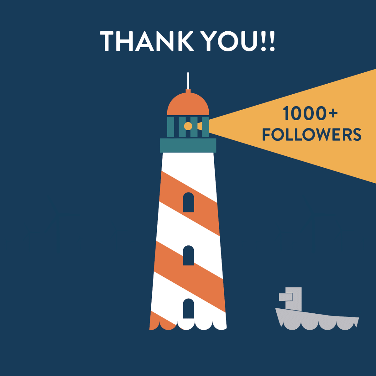
Gif for Linkedin 1000 followers Post
My work here also involves creating a repository of icons in the corporate house-style to complement written and verbal content for presentations, website, animation and printed material...
...and creating illustrations, interactive elements and layouts for online platforms.


Illustration options for altimeter
Layout for Wake-effect game

From flyers and badges to greeting cards for clients, every printed material is meticulously designed to follow DOB-style. The brand guide is our bible.


While DOB-Academy has an established house-style, the graphic department is also involved in brand-development for its sister companies and industry collaborations.


